How to customise your accordion blocks in Squarespace 7.1
So that you never have a boring FAQs section again…
I love the new accordion block in Squarespace. It’s a fantastic way to display information without overwhelming the user with huge blocks of text. But there aren't a huge amount of styling options available. That’s why in this blog post, I’ll show you how to style your accordion block in a couple of different ways so that you make yours feel on-brand for your business.
Basic accordion block settings
Before we dive into the code, let’s start by just going over the basic styling settings that are available in Squarespace. The minimal clean layout of the standard block can be perfect for elegant, minimal brands.
These are the things that you can edit in Squarespace, without touching any code:
Title and description text style, i.e. heading or paragraph options.
Text alignment and placement options of left, centre or right (although I’d only ever recommend using left aligned text here!)
The ability to add divider lines between items
Select the divider line thickness
Plus sign or arrow icons to symbolise the drop down( and the size of the icons).
Row padding - this will really depend on the style that you are trying to achieve.
For the below examples, I am going to select no divider lines and a small row padding. Now for part two, head over to Design > Custom CSS and get ready to add some CSS code to style them!
Add a background colour to your accordion block
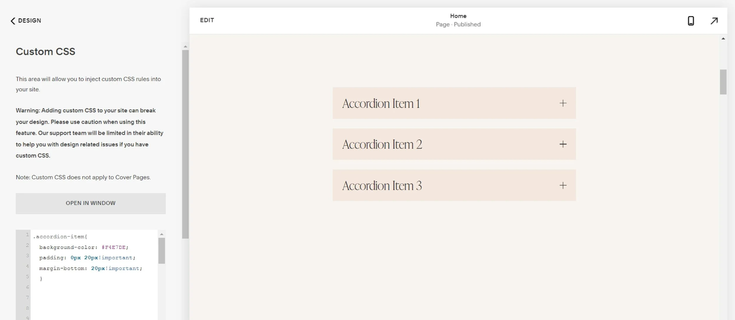
To inject one of your brand colours as a background colour, paste the following code into the Custom CSS panel:
background-color: #Your Hex code goes here;
padding: 0px 20px!important;
margin-bottom: 20px!important;
}
What does the code mean?
.accordion-item - this is the CSS class to target each accordion item.
background-color - this is the background colour that we are going to add to the accordion item.
padding: this is used to add extra spacing between the text and the edge of the background colour.
margin-bottom - this code is used to add a little bit of space between the items and break them up.
!important - this is used to override some of the more stubborn settings in Squarespace.
2. Add a curved corner to your accordion blocks
Want to add curved corners to the accordion items? This is perfect if your brand has a more welcoming, playful feel to it. Simply add an extra line of code to the above section, border-radius: 50px;
Your code will now look something like this:
background-color: #Your Hex code goes here;
padding: 0px 20px!important;
margin-bottom: 20px!important;
border-radius: 50px;
}
What does the code mean?
border-radius: 50px; - This sets how rounded the corners of the background are, this number can be decreased to create a subtler corner radius.
3. Add a border to the accordion blocks
Your code will now look something like this:
background-color: #Your Hex code goes here;
padding: 0px 20px!important;
margin-bottom: 20px!important;
border-radius: 50px;
border: solid 1px #000000;
}
What does the code mean?
border: solid 1px #000000; - Solid refers to the line style, 1px is the thickness of the border which can be increased, and #000000 is the Hex code for the colour black. This can be changed for any other Hex code.
You can also remove the line border-radius: 50px; if you don’t want the curves corners.
4. Or, how about a cute outline border effect?
This one’s a little more unusual, but could work great with the right brand. You could also have a more neutral look by removing the background colour.
background-color: #Your Hex code goes here;
padding: 0px 20px!important;
margin-bottom: 20px!important;
border: solid 1px #000000;
outline: solid 1px #000000;
outline-offset: 5px;
}
What does the code mean?
outline: solid 1px #000000; Similar to the border property, solid refers to the line style, 1px is the thickness of the border which can be increased, and #000000 is the Hex code for the colour black. This can be changed for any other Hex code.
outline-offset: 5px; - This refers to the space between the edge of the item and the outline.


